David Hockney and portraiture

Well known for his monumental landscapes, Hockney has made
several series of portraits depicting office staff, friends, family and other artists.
Each piece is of the same size (121.92 x 91.44 cm) canvas, with the sitter
based on the same chair against a vibrant blue background and green floor; occasionally
switching orientation. A single coloured background was desired in order for
the attention to fall onto the person only. Incorporating the whole body was
important to Hockney as each element is unique (like pairs of shoes) and part
of the same person. Leaving the clothes choice up the individual, the only thing
Hockney would change was the angle of the chair which they sat on. Furthermore,
Hockney has made over 300 self portraits in which delicate line and colourful
prints depict over-exaggerated expression to subdued emotion. After moving to California at the end of 1963, Hockney began experimenting with paintings of uninhibited
life of athletic men within swimming pools and photography, leading him to make
his famous photocollages.

References: https://youtu.be/QCB-inw3kMk
https://thedavidhockneyfoundation.org/series/self-portraits?page=5
https://www.christies.com/features/David-Hockney-Portrait-of-an-Artist-Pool-with-Two-Figures-9372-3.aspx
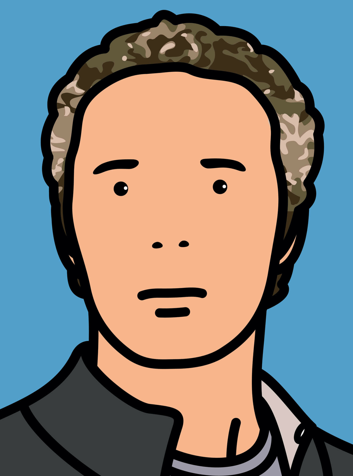
Julian Opie, a British artist best known for his distinctive
depiction figures and portraits. Recognisable by the thin black outline of
features and solid flat colour, Opie’s work is a mixture of Pop Art and
minimalism, and wholly contemporary. Regarding his work as knowing something “as
simulations but knowing at the same time that they are real” is the central
focus to his work. With only a few lines and several tones within hair, Opie is
able to replicate what is unique to each character. Influences for his work are
recognisable as Japanese woodblocks, classic portraiture and cartoon.
References: https://www.npg.org.uk/collections/search/person/mp59425/julian-opie
https://www.artsy.net/artist/julian-opie


To begin with I made some general portrait studies based on various styles i liked, like Juji Ito and several online artists. And including Julian Opie's minimal technique and pallet i composed this final piece using references from online images and photographs of friends. I personally like this piece most as the composition is the most effective, but as these were all vague ideas and exploration final composition was not a huge concern when drawing.


Below are closer shots of some of my favourite drawings/elements
Furthermore, I made an observational study of myself based upon reflection using pencil unlike Hockney's medium as i am more confident doing sketch observation. Also, i prefer the pencil marks when doing portraiture rather then brush strokes.
Following Opie's minimal style i have developed several faces which i am intending to develop into a short animation in which i aspire to use all 6 faces only. By using the same size head and neck the only variables are the facial feature size and hair. However, the 3 faces seen above have been made using reference to Opie's style rather then observation of a face as i made them for the purpose of the animation rather then to represent a person's portrait. Thus, the faces are missing any distinguishable features making these portraits mediocre on their own. For the final 3 faces i intend to make the portraits based off photographs so that this style can make more distinguishable portraits whilst remaining minimal.


Referencing a photograph, i used 4H and B pencils to depict the photo in a lightly stylised way, focusing on trying to achieve depth within the tones in a brief amount of time. Intending to be similar to the sketched drawing earlier in this post, i do not believe this drawing was as successful as i rushed areas of it and need to develop the shading on the arms and legs in particular. However, had this been a portrait piece alone i think i would like the outcome more and could have made for an interesting composition.


Some problems which i experienced during this drawing was that it was very small as it was on an A5 page meaning detail and precision on details and proportions on the fingers was difficult to achieve. Furthermore, the reference photo did not include all of the feet meaning i had to leave the drawing to abruptly stop. Whilst i did try to use other references of shoes to complete the drawing i could not achieve the correct angles so i chose to leave it as it is. Furthermore, I think using a background colour would work effectively within this drawing, similarly to how Hockney incorporates the blue backdrop. I would intend to use a light red/pink for this drawing and would have the tonal change just above the heal of the foot.
Similarly to the drawing above, this piece was intended to explore the harshness of line and how it can be added to a gradient to emphasize the piece. This worked most effectively on the hair and cheeks as i did not develop this method much on the arms or top. I think with the style of shading i was trying to achieve within this drawing, it would work effectively is i was to do some proportional outlines with the colour/shading being what stylises the drawing.
Overall, i think i rushed the piece a bit subquently leading to
Following the simplistic stylisation of Opie, i made this drawing in order to trial different angles and to have comic-like shading. I really enjoyed making this drawing, but unlike Opie and Hockney i did not observe a particular person, rather a wooden manikin for angles/proportions.

Unlike most copic drawing, the back of this piece is actually very interesting and has the potential to be it's own piece in my opinion. It also more closely resembles Opie on the facial areas due to the tonal difference and shape being the only facial detail.


Comments
Post a Comment